Monday, 24 February 2014

Work inspired by artists

Previously in my sketch book I have done a series of experiments of Rikka Ayasaki's work by observing small sections of her paintings.
Since then my work has progressed and  I have began working in her style on canvas using oil paint, I firstly worked by observing her painting 'Spring haze 7030'.

Bellow Rikka Ayasaki 'Spring haze 7030' created in 2013, Acrylic painting, (55 x 46 cm) (left) (1) and my experimental painting from observing 'Spring haze 7030', media used oil paint on canvas ( 23 x 30 cm) (right)


The overall outcome of this painting is quite different to what I expected. Firstly Rikka Ayasaki painted 'Spring haze 7030' using acrylic paint and most likely a paint brush, whereas I decide to finger paint using oil paint. The reason why I chose to paint in this way, was because from the experimental studies that I carried out in my sketch book I discovered that oil paint is more creamy and blends more effectively, in my opinion even looks better, as acrylic paint left streaks and the colours did not blend gradually as expected. There were quite a few problems whilst painting,firstly my painting is very smooth and the colours are all blended together in a horizontal motion, but Rikka Ayasaki's 'Spring haze 7030' has more circular shapes, for instance she painted her clouds so that they would stand out, whereas mine just blended in. Another problem was the green hill at the bottom of the painting, as seen in 'Spring haze 7030' it contains tones with various colours and shades (brown, green, burgundy etc.) Yet mine is mostly plain green, however I did try applying more colours to it, however because the green coloured paint was still wet, the colours just blended up with the green and became hardly visible. I think what I should have done was wait until the first layer of paint dried up a bit, ant then went over it in the other colour, however I can still do this. Also maybe if i would have used a paintbrush the painting would not be as blended, also I could have used turp substitute to thin down some of the paint. 

After the experiment with 'Spring haze 7030' I decide to start working in the style of Ayasaki from my own photographs.


Above on the left side is a photograph I took in Lithuania during the summer of 2013, from my grandmothers flat balcony.
I thought this photograph was great to use to work in Ayasaki's style, because similarly to her work, this photo contains lots various different shaded colours, with darker and lighter areas. The image on the right side is my painting outcome.

As you can see I only focused on the sky, and did not include the buildings. I faced a similar problem as with the painting of 'Spring haze 7030'  I finger painted with oil paint on a canvas ( 23 x 30 cm)   , meaning the colours were all smooth and blended up together, meaning I could not really create a cloud effect etc. Even so, I think this painting turned out quite effectively, because instead of focusing on the details of the clouds etc. I put more effort into getting the colours and tones right (overall observed colours of the sky the most), however there was a minor problem with the paint, because as you can see in the original photograph the right bottom corner of the sky is a soft yellow colours, whereas in the painting it is a dirty light blue, this happened because i tried to blend the light yellow and light blue oil paint, whilst the paint was still wet, so it became slightly light green. This can be fixed by going over the greener area with light yellow oil paint.

I then decided to experiment with darker colours, so I decided to paint from a photograph that I took on the 18th of February 2014, whilst traveling in a car home from Oxford.( photograph on the left bellow) and on the right is what my painting turned out as.

       
This painting was Once again done by finger painting with oil paint on a canvas ( 23 x 30 cm) Hence why there are obvious horizontal lines of a rubbing/blending motion. This painting was really hard to do because the darker colours were much harder to blend, and even thought as seen in the original photograph there were lighter orange coloured areas, because of the blue wet paint mixing up with the orange paint creating green unwanted colour, and just generally dark paint, the lighter areas were hard to do, so I will go over them again, since now the paint is dry so the orange paint wont mix with the blue. 

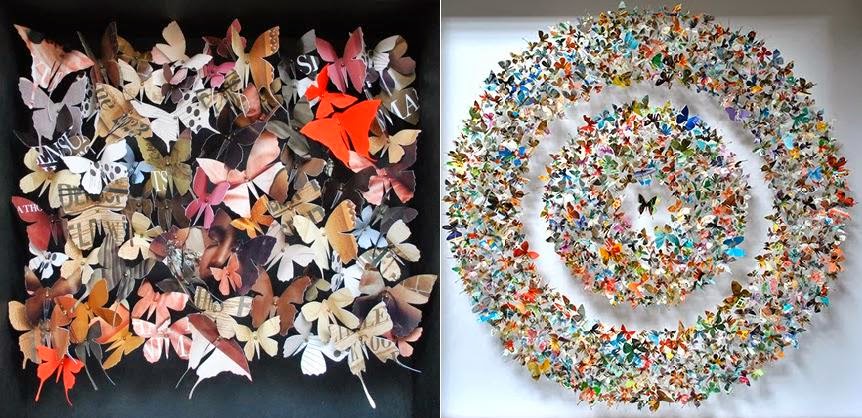
Lastly (still focusing on the same photograph) I decided to merge two artist styles together. So I used Rikka's Ayasaki's landscape painting style idea and merged it with Rebecca J Coles paper butterfly assemblage style.

Here is the final result 


As all the other paintings I once again finger painted with oil paint, even thought there is disadvantages of doing so, I personally find that finger painting allows me to have more control over what I paint, and I don't get the same control when I use a paintbrush. 
This attempt of the sunset painting was much better, because the colours blended together slightly better, although I still experienced the unwanted green paint problem. For the paper butterflies, I used a similar Idea to the butterflies that I have already done in Rebecca J Coles style,  however differently to the butterflies I done before, this time I used older book pages, that looked more worn and old, and then I slightly burned some of the butterflies, to create this old fragile look, similarly how a dead pinned down butterfly would be very fragile as well. I tried to used paper that was more natural and organic looking, because if I would have used some bright coloured pages (like pink or green) for the butterfly silhouettes, there would be no colour harmony, and the whole piece would not look as bold and effective.
I personally feel, like there does not need to be anything more added to the piece, because I like it looking as it is, and I don't want to overdo it. However I feel there may be a need to add some sort of texture to the canvas surface. 

Reference;

Saturday, 22 February 2014

Artist Analysis - Michael Cina

Michael Cina is an artists,painter and graphic designer, currently based in Minneapolis, USA. He is known for creating work that is innovative and somewhat unconventional. In 2000's Michael Cina became a co-finder of WeWorkForThem design studio and in 2010 he opened his own design studio called Cina Associates. He creates both painting and collages, and in all of his work he uses a wide variety of various media such as : pigment, ink, acrylic paint, boards, paper, canvas, water colour, graphite, serigraph, tempera etc. 

What I found unusual about his work, is the way it's expressive, free flowing, with no particular clear lines, quite unclear with no specific subject. Yet when observed with more effort, the viewer is able to see something in his work, some sort of subject with the help of imagination, and it may be different for each individual.
The majority of his work is very bold and bright, very lively and energetic, however in a way still modest and not overdone. His work expresses shapes, forms and even mood.
When talking about his own work Cina has said "Observation is very important to me. I don’t see myself having much to do with fantasy, but I do have a fascination for the unseen. When I see something that interests me, I try to understand why I like that particular thing. Is it the color, form, shape, composition, texture, etc?" (1) This suggest that the artist is very experimental both in the terms of the media he uses and the way he paints. I also found out that in a interview he describe his work process and the way his work turns out by  "I have always learned best through “accidents.” Early in my career, I noticed that “mistakes” (early in the creative process) can be a huge asset. So I have tried to incorporate making mistakes into how I work" (1)

Here is some of his work bellow:


Above, Michael Cina - 'Hovering Over the Water' fermented acrylic on paper (left) (2)  and Michael Cina - 'Apex' Archival ink prints on Cotton Archival paper (right) (3)


As seen, his work does not consist of a specific subject, however there is probably a strong meaning or emotion behind it.  For instance the artist has said that a big part of his work inspiration is music, as it takes up a big part in his life. So all of this work could have been done to express that music, the way it makes him feel, which might justify why his work is so organic. 


I have chosen to analyse one of his paintings called 'Vault of the Sky'. The media used for this painting is acrylic on museum board 2" frame. (reference link 5) Here is the image bellow: 


To me it is an expressive abstract painting, I feel like there does not need to be a huge splash of various colours, to make it expressive. The reason I like this painting so much is because it looks uplifting. When I look at this painting, It makes me imagine that I am rising up from underwater in the sea but never actually reach the top,although I'm surrounded by the light of the sun the dark endless water is still around me. Or maybe this painting represents the rising of the sun, as the light yellow sunlight slowly reclaims the sky from the darkness. Honestly there are so many things this painting can be representing, it could merely just be a painting expressing the feeling of how music or happiness warms up your mind/body, it really is all up to the viewers imagination.

'Vault of the Sky' is similar to work by an artist and architect called Thierry Despont, who creates paintings of various planets, his work has been described as follows "The imagery of the paintings is based on heavenly orbs: mysterious planets that revolve from darkness into light". There is resemblance between the two artists work because the paintings have a similar texture, surface and the appearance as a whole. Possibly 'Vault of the Sky' can be viewed as a close up of the moon or another rocky surface planet. Bellow are some images of work by Thierry Despont.


Above, Thierry Despont "NB 17-T" 2010 ,Jacquard tapestry (left) (6) and Thierry Despont "NB 06-T"  2010, Jacquard tapestry (right) (6)


I think what makes 'Vault of the Sky' stand out so effectively is the contrast between the black and the use of pastel pink and yellow colours, as they are lighter they illuminate the whole painting, as if lights at night. Also because the colours are layered over each other they create this gradual change in tone from one color or shade into the next, fading and softening into the other colour, especially the pastel pink and pastel yellow colours, but then there is this quick and bold change in colour when from the two soft colours into black. This really adds a bold effect to the painting, especially highlighting the softer, lighter colours. 

Also the layering of the paint creates this bumpy uneven texture, this is probably because the acrylic paint in  'Vault of the Sky' is applied quite energetically and It seems to me that there was either water applied to the surface to add this uneven texture, or there was something pressed down against the surface whilst the paint was wet, because it appears as if air bubbles formed on the surface of the painting, especially round the right side where the pink paint is. 

The painting is in a 2D form, however there is no clear shapes or lines in it, as mentioned before the whole painting is free flowing and quite organic, as it was created freehand. Even so there does not need to be clear lines or some specific subject, because this way the painting is more unique and original, you would not get or recreate exactly the same thing ever again. 

Composition wise , when I look at the painting the first thing that I notice is the light colours at the bottom of the image, and only after that do I notice the dark black colours, because it is not as lively and bright as the yellow and pink pastel colours. 

Overall I think I could use Michael Cina's style and techniques as there is so much I can experiment with. He has used a huge variety of media through out different pieces of his work allowing me to freely explore different options and see how different media turns out on different materials. Also I am impressed by his expression of emotions through colours, with no need of justifying or showing a clear subject. I think because my theme is developing around butterfly colours, his style would really help me to figure out a way to show the beautiful colours their wings have, without the actual need of having the butterfly, in a way zooming in just into the colour itself and closely observing it.

I have already tried to work inspired by 'Vault of the Sky' by layering acrylic paint and ink together, to create a chipping paint effect with gradual colour change similar to Cina's work. Here is my work bellow :


I like the effect that the layering of the two medias creates, as there are both lighter and darker tones creates. I took this technique even further and created a butterfly drawing using conte-crayon, ink and pencil, using this photograph of a butterfly Here is my work bellow :


Although this drawing did not turn out as successful as I hoped, it gave me the idea of using media other than pens or pencils to draw and add detail to butterfly wings with free hand drawing. In a way free-flowing lines create a more effective and organic and natural looking effect, than it would if i was to carefully draw the butterfly.


Reference:


2) http://cinaart.com/Art/Hovering-Over-the-Water
3) http://cinaart.com/Art/Apex
4) http://cinaart.com/Art/Funerary-In-Soft-Limestone
5) http://cinaart.com/Art/Vault-of-the-Sky
6) http://www.marlboroughgallery.com/exhibitions/threading-orbs-an-exhibition-of-recent-tapestries-and-works-on-paper-by-thierry-w-despont

Friday, 21 February 2014

Artist analysis - Rikka Ayasaki

Rikka Ayasaki is a Japanese modern painter, born Tokyo, but currently based in France. In Japan Ayasaki Studied traditional sumie (ink wash painting) and exhibited in Japan before establishing her self in Paris, where she joined the Studios of fine Art.
She is known for creating Oil paintings, black and white ink wash paintings on Japanese paper and Ink paintings on canvas.
Rikka Ayasaki art work focuses on painting natural landscapes, for instance mountains and sunsets. However what makes her work remarkably beautiful, is the way she blends colours together to represent what she sees in such depth and detail. In a majority of her paintings, she really focuses on the way colours in the sky collide together to create different subtle colours and tones, still keeping the "zen universe and the dazzling quality of SUMI (Japanese ink) in which her art finds its roots" (1).

When talking about her work the artist has said "Many times, I have been asked why I do not paint in a progressive flow: think while painting, add until satisfactory."(2) Which suggests that she is very dedicated and inspired to making her work to a standard that satisfies her. 
She has also said that she creates her work so that "the spectators of my works will lend an ear to the lines they express and participate to the interaction they are calling for." (2)
In a way Ayasaki sees art as a form of a play, as she has expressed her thoughts, that artists are as if screen writers or producers and the colours are the performers.

Here is some of her artwork bellow: 


Above - Rikka Ayasaki , Passions, sunset 5006, 2008, acrylic, oil Painting (left) (3) and Rikka Ayasaki, Romance 7021, 2012, acrylic, oil painting) (right) (4)

One of her paintings that I have chosen to analyses is called "Spring haze 7030" created in 2013, using acrylic paint. Here is the painting bellow (5)

This is my favourite Rikka Ayasaki painting, I like it because it is very subtle and calming, she creates something very beautiful and expressive through the use of the right colours, shades and brushstrokes.
I like the fact that her work is not picture clear, leaving the viewers to decide what the image they are looking at is in their perspective. 
Personally when I look at this painting, it relaxes me and for some reason makes me sad, I straight away think that this is a sunset somewhere in the hills of the Himalayas, and the whole place is surrounded by emptinessisolated from the world.  There is something very peaceful about it, like this is Ayasaki sharing a moment of beauty, happiness and emotion or emotional state by expressing it through colours, light and tone.

The use of a combination of oil paint colours such as Flesh Tint, Cadmium Red Purple with a hint of Brilliant Yellow-Reddish and O-H Blue Grey, creates a naturalistic and subtle light toned sky effect. The colours combine and blend well together, creating a colour harmony, it is due to the way she does her brush strokes that although the colours are all blended together they still stand out individually, like for instance in "Spring haze 7030" the layering of the colours creates the visual effect of clouds, as well as adding a bit more depth and making the 2D surface appear more 3D. 

Rikka Ayasaki does not create clear lines or shapes in this painting, the whole art work is very organic looking, close Enoch to free flowing and regardless to some outline of the clouds and mountains, the whole painting is quite blurred. Texture wise the painting looks quite fine and smooth with no real roughness or coarse etc. 

Composition wise, when I first look at the whole painting, the first thing that grabs my attention, somewhat like a focus point, is the dark green mountain on the bottom of the image. Then my eyes are encouraged to follow up and my attention is the grabbed by the mountain  on the left and then to the upper mountain on the right side. And only then do I look up to the sky to notice the harmonious colours shown. 

I think the reason why Ayasaki created this painting was because she wanted to take the viewer  out of reality, to this certain place, to share what it feels like seeing such natural beauty of the sky and nature around us, express to the viewer that it is not only the whole picture that is beautiful but every single detail of it, every individual colour is unique and different, without these little details, the picture would be different, perhaps less stunning

I believe Rikka Ayasaki's style and technique could relate to my exam question of "closely observing" and the theme of butterflies and their colours, because I really like the idea how she shows colours in her work, she highlights that what matters is not actually what specific subject the picture is of, but what the picture is truly showing, I think this is exactly what suits my theme, because I am more interested in the way lots of different toned and coloured etc. butterflies, put together create this one powerful image, rather than the actual shapes or forms of the butterflies.  
However I have previously done an analysis of another artist Rebecca J Coles, whose style and technique of paper assemblages of butterfly silhouettes combined with the way Rikka Ayasaki paints skies etc. could be put together to create a unique piece.  I love the way Rikka Ayasaki expresses her ideas, feeling and understandings through colours, and Rebecca J Coles also focuses a lot on colour stories for her work. 
So I have already began painting in the style of Rikka Ayasaki, I have created some paintings in her style, and now I am beginning to do paintings of the sky during sunsets, in her style but from my own photographs. And I will try to develop this by combining my own paintings of the sky (in Rikka Ayasaki's style) with similar coloured paper butterflies, to create a combination of a painting and butterfly assemblage (in Rebecca J coles style)  The whole idea would be closely observing how little things in a beautiful sky (in this situation it will be various different coloured butterflies) combine and add up together to create the whole thing, as if dozens of butterflies are what make the sky purple or pink.


References:

1) http://ayasaki.free.fr/eg2.rikka.ayasaki,sumi-e,gallery2.html
2) http://ayasaki.free.fr/statement.html
3) http://www.saatchiart.com/art/Painting-Passions-sunset-5006-Painted-in-2008-116x81cm/6134/1517604/view
4) http://www.saatchiart.com/art/Painting-Romance-7021-Painted-in-2012-70x70x5cm/6134/1554747/view
5) http://www.saatchiart.com/art/Painting-Spring-haze-7030-55x46cm-Painted-in-2013/6134/1911688/view

Thursday, 20 February 2014

Artist Analysis - Rebecca J Coles

During my artist research I discovered an artist named Rebecca J Coles. She is a British paper artists  who creates paper assemblages of butterfly silhouettes, which are then encased in box frames. 
Coles was born in Bath, between the years of 1996 – 1997  she had achieved an National Diploma in Art & Design, Winchester School of Art,  between 1997 – 2000  BA (Hons) Woven Textiles, Winchester School of Art, and 2000 – 2002 MA Constructed Textiles, The Royal College of Art, London.

What makes Rebecca J Coles work unique is the fact that she focuses on recycling a medium such as old magazines, newspapers and wallpapers. that would otherwise be thrown out. She puts a lot of time and effort into her work, as she cuts out each butterfly individually by hand. It is quite complex, she has describe her process as follows "I start by developing a colour story, decide on a shape, and then let my work grow organically" (1). She begins by looking through and cutting out various butterflies, some of her work is planned and based on a colour palette, shapes and sizes, concentrating on a original idea, whereas some is organic, as she creates it as she goes along with the work.  

The artist has said to have a few influences, from childhood her mother has influenced her as she has said "she filled my imagination with creative projects"(1). However her greater influences are artists Wycliffe Stutchbury and Helen Beard who she has said to admire, and a fashion designer Jessica Ogden, who recycles and reworks old fabrics with an element of handicraft, similarly as Rebecca J Coles does with her paper assemblages. 


Above, Wycliffe Stutchbury "13 Commercial Road" 2009, Discarded floorboards (left) (4) in the middle Helen Beard "Tall Beaker" Slip-cast porcelain, 15 cm height, 7 cm diameter (5) and on the right Jessica Ogden "SPRING/SUMMER 2006 READY-TO-WEAR"  (6)

Although a large majority of Rebecca J Coles work is based on the subject of butterflies, for her the butterflies do not symbolise anything, except the fact that she finds them beautiful to work with. 
The only real influence that she may have had of butterflies was in her childhood, when she used to fold pieces of paper in half and cut out butterflies. To her it's not actually the butterflies that fascinate and interest her, but the way  the viewer, can be made to observe something that’s not actually there, or focusing on a small section of the overall image which becomes different when it’s dissected. She wants the viewer to look at something that was once an everyday item, like a magazine, and see it beyond its original source (2).

Here is some of her work bellow ;


Above Rebecca J Coles "Butterfly Box 09"  (left) (3) and Rebecca J Coles "Stamps C" (right) (3)


The reason why I like Rebecca J Coles work, is it consists of such detail, every individual butterfly has to be thought through, like what pieces of media is to be used or where should it be placed, and yet her work reflects beautiful simplicity.


My favourite piece of work by her that I have chosen to analyse is called "Private Commission". It is a paper butterfly assemblage based on a green toned palette  (bellow (3) 


When I look at this art work, I see a large bundle of butterflies flying in circular motion like a spiral, and the further they are (smaller, cream colour butterflies) the less detail and colour you can see. 
Yet somehow I can also see this as a close up of a green eye, with the black circle being the pupil and the green butterflies being the iris, as if with every single one of those different coloured, green toned butterflies put together create the whole green colour of the iris. 


To make this art work a success, Coles had to carefully think about the sizes and the shapes of the butterflies she makes, to make the whole picture look appealing. As seen in "Private Commission" there is a variety of different shaped butterflies some small some large, this gives the work some variety, instead of being the same shapes and forms. Especially since the butterflies are pined down, making a  2D flat media look 3D, as if an illusion that the butterflies are floating in the air. She creates the butterflies by folding media in half and cutting out silhouettes of the insects. 

Colour wise, "Private Commission" has a colour harmony, as with the use of the different toned green (secondary colours) alongside the light creamy colours, the colours of the butterflies blend together, creating a gradual colour change from dark green butterflies to very light (creamy) ones.
Coles spends a lot of time just planing and searching for the right media e.g. magazine pages, to cut out from, because her work begins by creating (as mentioned before) a "colour story".  So it is very important that the colours used are complementary and similar toned, as the different shades of green, because this allows the butterflies to smoothly blend.  By using a Black background as a base for her work, the artist allows the lighter butterflies to really stand out on the surface, making them look more bold, whereas if she was to use a green or a very variegated background, the butterflies would be bland and vague, and would not grab attention. 

It seems like the artists work lacks a variety of texture, as generally it is mostly smooth or glossy depending on the media (paper) used. This is one of the reasons why for instance  "Private Commission" regardless to the beautiful butterfly detail, looks plain and simple. Whereas if it consisted of some rough or bumpy etc. texture, it would add more depth to the art work.


The most important thing for  "Private Commission" and even other pieces of Coles work, is perfect composition. Coles has to carefully decide where to place a specific butterfly (on the base or the top of the pins) depending on its size, colour and shape, to create unity in her work, and make it appealing to the eye. Because if she was to just place the butterflies randomly, the whole piece would not flow together as effectively. Because as seen in "Private Commission" the bigger butterflies are positioned round the outer circle and then medium sized butterflies are positioned mid way, slowly changing to small butterflies in the inner circle. 

It is hard to say what Is the purpose behind this art piece or why it was created. I think Rebecca J Coles, created this art piece because she finds beauty in the way recycled media can be transformed from a ordinary piece of paper/wallpaper etc. into something so delicate and exciting, making her work come "alive". From my gathered research it is obvious that the artist simply enjoys working with paper as it is a malleable medium, and it is something she used to do when she was younger, so possibly creating art pieces like "Private Commission" is so enjoyable to her, because it reminds her of her childhood. 

Overall Rebecca J Coles work reflects an art form that is different to a typical painting etc. My chosen exam question is "closely observing" and I am focusing on the theme of butterflies and their colours, Rebecca J Coles work could help me bring new ideas and techniques as well as ways of presenting  my work (composition and colour wise) to make it look more interesting. Because it's the little details and the way the work is arranged that allows to create a specific visual effect. I have already done a few experiments in her style, however I am going to continue experimenting with different types of media to cut out the butterflies from and different backgrounds and colour themes, to see what colours and media work most effectively together. 


References

Thursday, 13 February 2014

Artist Experiments

This week I have also began bringing artist influences into my own work. I have began experimenting with artist techniques, the media they use and the way they present their work. I have also tried to incorporate their styles and techniques with my butterfly colour observation theme. 

For my observational drawings (that I drew over artist experiments) I observed some dead butterflies (images bellow)


firstly tried to work in the style of Michael Cina, I looked at a series of his paintings along with collages etc.  Here is what I have done and achieved: 

This was the first painting of Michael Cina that I used for inspiration, style and techniques (bellow). 
1)It is called Ways of Serigraphs
A. Cecil Taylor at Piano
B. Moving Portrait
C. Atlantis Launch
D. Runner Owl
E. Dexter Gordon Smoking, Medium: Serigraph.


This is one of  my favorite pieces of work by him. I like the idea how he has included not one but many subject matters in one drawing. This is really interesting because everyone may see something different. It is impressive how he uses lines, because they aren't very clear, however I can still see a man playing the piano whilst possibly smoking a pipe. Although the colours may not really be relevant or realistic to what they would be in reality, they really make the art work stand out.

My attempts to work in this style were not as successful, although there is similarities to Cina's work, I found it hard to create such lines as he had done. Instead I just drew some butterflies that I have observed (butterfly images above) and then layered over them with paint, pen and body spray (on some) I think the problem was the fact that I tried to keep my work neat to some extent,I was scared of overdoing and ruining my sketch book and this stopped me from really expressing my drawings. However I will come back to these pages at some point later on an possibly add more texture and layers.


The pieces of work bellow were inspired by two of his collages 'Past Context' and 'Collapsing'    Personally these are my favorite sets of drawing in the style of Michael Cina.  Because the collages work very well as the backgrounds for the butterfly drawings, as they immediately add some kind of texture, colour and depth. They are also simple yet very effective. For all of the 3 Drawings I chose to use conte-crayon, because I like the shadow effect it gives whenever smudged.


Bellow Michael Cina- 'Past Context' (3)  collage (left) and (2) 'Collapsing' Acrylic on Paper (right)


Other pieces of work that I have done in his style were inspired by his work called 'From Above' and 'Ships Plowing Deep Waters'. 
Although some of these drawings/paintings turned out okay, the majority of them I do not like. It is mainly because in some of them I overused the conte-crayon making it look like there is too much going on in one drawing, especially whenever the butterflies were drawn in conte-crayon on a bright acrylic paint background. I have tried fixing some of them by putting white acrylic paint over them, and it has slightly helped, so it is quite likely that I will do so for other drawings that did not work out well. 


(Bellow Michael Cina - 'From Above' Mixed Media on Paper (4)(left) and 'Ships Plowing Deep Waters' Acrylic on Board (right) (5)


My most successful work was in the style of Rebecca J Cole, I really   enjoyed creating paper butterflies on canvas. Although it was challenging to find the right materials like paper, in the right colours (so that each painting would have a specific colour) It did turn out similar to what I was expecting. The only things that I should consider doing later on, is adding more detail e.g. texture to the canvases, because I personally find the painting quite plain. I will also try and use older materials, to give a older more worn retro kind of style, as well It would be interesting to combine her work with another artist that I am studying. Here is the work that i have done :


(Bellow Rebecca J Coles -  Camberwell Beauty' Nymphalis antiopa) (6)


The third artist that I recently began looking at is Rikka Ayasaki. 
I have not yet done a lot relating to her work. However I have closely observed small sections of her paintings.
For these observations I used oil paint. Even though oil paint does look good whenever blended together, It is quite hard to use. I found it quite hard to blend it and It takes quite some time until it fully dries. Here is some work that I have began;


Bellow are the names of her paintings, in the same order as the images of her painting observations done by me above;  Rikka Ayasaki-  'Passions, twilight 7013 ' 2012, Acrylic oil (8) (left) 'Passions, Sunset 5076' 2013, Acrylic oil(7) (middle) and 'Spring haze 7030' 2013, Acrylic (right) (9) 


Alongside oil paint experiments, I decided to similarly observe small sections of her paintings, although this time using acrylic paint, as it is the media that the artist often chooses to use.
The middle image and the image on the left were observations of the painting "Passions, Sunset 5076" (7) whilst the image on the right was small observations of my own photograph of a sky ( https://blogger.googleusercontent.com/img/b/R29vZ2xl/AVvXsEjlsYE8ggSlODyWIDX_zkYocepDSNzS8bfjZg4na3iM_HV7vZTPsnI_4fBcLObLR-Lq429zgl520uoKz4w_79TaJTRUlI555-0ZAg9lU987wEprU1QC4uNuD7FNvwB88KH6eNj4UNG2dR4/s1600/BeFunky_DSC_1444.jpg.jpg) still inspired by  "Passions, Sunset 5076".


As you may see, for the middle image I used the sellotape transfer technique, as I wanted to see how  these (https://blogger.googleusercontent.com/img/b/R29vZ2xl/AVvXsEgXDTM2Ha5eHPD5EPr56vXw5VfgrpaIwpG8Tgdyp79KwYlxHQ1i2nXOr-Hvl8lfhpKpDWguLbn3M7I88KrINnJnkE1ufXB-xSS9x9hd5NheSApdM8wNUwC7lNRqYasmvpy7OV-KnkCxr3Y/s1600/IMG_2307.JPGbutterflies) butterflies would look on a colourful background as such. The down side is that the butterflies are too dark, it is hard to see their details, patterns and shapes that easily, it would be more effective if the butterflies were to be colourful or lighter coloured.  Overall the acrylic paint was difficult to blend together, the colours did not gradually change from one tone to another and generally did not work effectively together, leaving brush stroke lines.
 So I think I will most likely still try and use oil paint for some of my work, regardless to the minor problems caused by oil paint, it blends more effectively and the texture looks smoother than with the acrylic paint.


References; 

1) http://cinaart.com/Ways-of-Serigraphs

2) http://cinaart.com/Art/Collapsing
3) http://cinaart.com/Art/Past-Context
4) http://cinaart.com/Art/From-Above
5) http://cinaart.com/Ships-Plowing-Deep-Waters
6) http://www.rebeccajcoles.co.uk/work
7) http://www.saatchiart.com/art/Painting-Passions-Sunset-5076-Painted-in-2013/6134/1727491/view
8) http://www.saatchiart.com/art/Painting-Passions-twilight-7013-Painted-in-2012-61x46cm/6134/1565457/view
9) http://www.saatchiart.com/art/Painting-Spring-haze-7030-55x46cm-Painted-in-2013/6134/1911688/view