Here is my previous work( https://blogger.googleusercontent.com/img/b/R29vZ2xl/AVvXsEj36CeyHGBW_fh3dJcVZQmbe4ygvlCFEwr8zxtOCtZk3fiWFgZYcvk8CDYJX_Vnm_Mv77gGMEe9zKtM7I8MP20GHM50-OKKjfCVR-mG3O2hVnELF4Qpm-u56E4WyYktiw2jjf4zKl8MHrM/s1600/IMG_2417.jpg ) However I have decided to experiment even more in this chosen paintings style, by using an even wider range of media. Here are the pages I created;


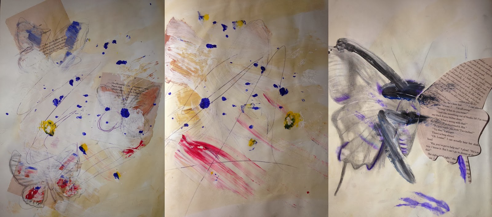
As may be seen above, this time I tried layering the media more to create a more textured surface, also similarly to "Ways of Serigraphs" this time, unlike in the previous drawings I have drawn, the lines created were continuous and quite free flowing. Although this technique and style is creative and expressive, It does not seem to be a suitable style for delicate creatures like butterflies. However I have considered the artist style to be very effective as background.
Bellow I created an assemblage/painting on canvas ( 23 x 30 cm) once again it was inspired by mostly Michael Cinas's painting "Ways of Serigraphs". My painting was created using tea stains, books, stamps, acrylic paint, pen, PVA glue and hairspray. In the begging the initial idea was to create a background in Cina's style, however as my painting progressed I decided that it needed a main of butterflies, so I combined Michael Cina's style with Rebecca J Coles butterfly assemblage idea and style. (http://ievaexamblog.blogspot.co.uk/2014/02/artist-analysis-rebecca-j-coles.html )

Overall the actual background turned out quite effective, for instance there is a variation of texture from rough (as the surface is quite uneven) to glossy and smooth surface (from the application of PVA glue and hairspray on the top layer of the painting). The one downside is the butterflies don't really stand out, as they are similar colour and material as the background. Even if visually they may not stand out, in real life butterflies often blend in and camouflage with various surfaces in order to hide or be unnoticed by predators to protect themselves, so in a way this could be viewed as butterflies in camouflage, and only if you concentrate and closely observe may you notice them. It is quite similar to some of the butterfly images that I have photographed, where they blend in with similar coloured surfaces and objects. Here are the photographs https://blogger.googleusercontent.com/img/b/R29vZ2xl/AVvXsEi-BXu61NjIAxHQ5UAJQywzI18hNBfVaGXsGlBg1hJSxcNyMgMac7S4WI1_2AGMDFLRUVpsspyaeeIAoGzDlQ-GZrD6dQPI7wQQ5DlbUb8Kor_F_dSEONmPBDWF3f9jeIIM08YZYgbnvfY/s1600/DSC_0481.JPG and
I also tried to work in the style of his other paintings.
Bellow Michael Cina - "From Above" Mixed Media on Paper.(left) (1) and Michael Cina - "Rapine" Pigment and Ink on paper. (right) (2)


These styles work very effectively to show layering of colours, as paint gradually gets layered on previously dried acrylic and oil paint creating a pigmented surface, that is both smooth and rough. Also the bright colours make the paintings look colourful and lively. This style is great as a background or base of my work.
Bellow Michael Cina "Tokyo Paedia" (3) mixed media on paper (left) and Michael Cina "Document Series" media: paper (right), Have inspired me to create collages with delicate butterfly drawings.


The reason I like Cina's collages, is they are simple yet effective, they don't consist of a lot of detail, and simplicity makes them stand out. I tried creating my own collages, inspired by "Tokyo Paedia" except after I had created the base of the collages, over the top I drew observational drawings of parts of a butterfly (bellow)
.jpg)
This style has helped me to think of how to combine both expressive, free hand organic looking backgrounds with detailed drawings, so that they would not be overshadowed by what is behind them. I now know that it work best when the background is not too bright or overdone, but more neutral and simple looking.
Lastly I took inspiration from Michael Cina's painting called "Toledo" Acrylic on paper (4) bellow.

Here are my experiments bellow :

The style of "Toledo" is rather unusual, it looks like the painting was made with very minim marks, like paint was just scraped above the surface. This is why for my experiments, I applied the acrylic paint onto the black paper using a piece of cardboard, the dipping it into the paint and then freely and without applying too much pressure scraping it over the black paper. It is quite a simple yet very interesting painting style do work in. It just shows that by choosing the right colours like light paint on black surface, can make the work be bold with minimum marks required.
References:
1) http://cinaart.com/From-Above
2) http://cinaart.com/Rapine
3) http://cinaart.com/Tokyo-Paedia
4) http://cinaart.com/Toledo
5) http://cinaart.com/Document-Series
No comments:
Post a Comment