
Thursday, 16 April 2015
Sunday, 23 March 2014
Exam final piece idea development
Final piece development
I have begun developing my ideas towards my final piece. The key aim during my development was to decide upon my final piece idea that relates both to my exam question of 'Closely Observing' and the theme of butterflies & their colours.
At this point I knew that I wanted to chose a canvases as my base for my final piece, similarly as I have already done whilst working in the style of Rebecca J Coles ( https://blogger.googleusercontent.com/img/b/R29vZ2xl/AVvXsEjz7lGA1Tb7GT865WVkeWQye8a6Gx3WnyC0SUX4S06i0xcGIYNf9edZvw92l9LNw6joT8vG9q_8PaXFJRJlBAOvNBZ1GmcoNcLt14D98ofnusG8gzLl-2F0A8yYD53YWgBIsZEqssfGMWE/s1600/BeFunky_DSC_1353.jpg )
I then looked back at all of my canvas work that I had created, during my artists experiments.

This is when I discovered that some of the canvases link together, both style and colour vise, so I re arranged them to this:

As may be seen I have removed the orange canvas, as the orange tones don't go with the blue/purple coloured canvases. I also added a new painting (bottom right side, large butterfly wing with a large background) Which was created from observing my own photograph of a butterfly:

The wing was inspired from my previous experiments ( https://blogger.googleusercontent.com/img/b/R29vZ2xl/AVvXsEiIaXbjSXaeBHy4_z3X3IZRkh-wauOu991eWMzCGlrfLSisbCSCoKjhD392w8eUgS6EwLQDJV43S3B9b-yQXMDmO7Z2Z3kSz36C1fMFwvzubvfZsun_habd18veFahryitHOwuGXIoBEcE/s1600/IMG_28498.jpg ) This really gave me a sense of direction, to what is should do next. Before even creating the large paper butterfly wing painting I first carried out some experiments in my sketch book, here they are bellow:

The idea of having paper wings came from my previous work done in the style of Rebecca J Coles ( https://blogger.googleusercontent.com/img/b/R29vZ2xl/AVvXsEjJ6xddEN-unMXWv04JLwfZ4M_rL_pZuVb_fAJjdH7kHfFbQETZP2CGWQw_pBHtwiu2v1bsgaoBMyjOl30oj-h-hjN-oIuEmENZo1dzFSeoWfuvCgcLu09gUAI3Z_D0zsouAWGufOBFZJY/s1600/gf.jpg ) I have since then made some alterations, for instance instead of doing full body small paper butterflies, I am doing half of a butterfly but on a larger scale alongside the various sizes of the small butterflies.
Neither less my wings are still strongly influenced by Michael Cina, and for these experimental wings, by his painting called "Rapine", image bellow.

(Above - Michael Cina 'Rapine' Pigment and ink on paper. (1)
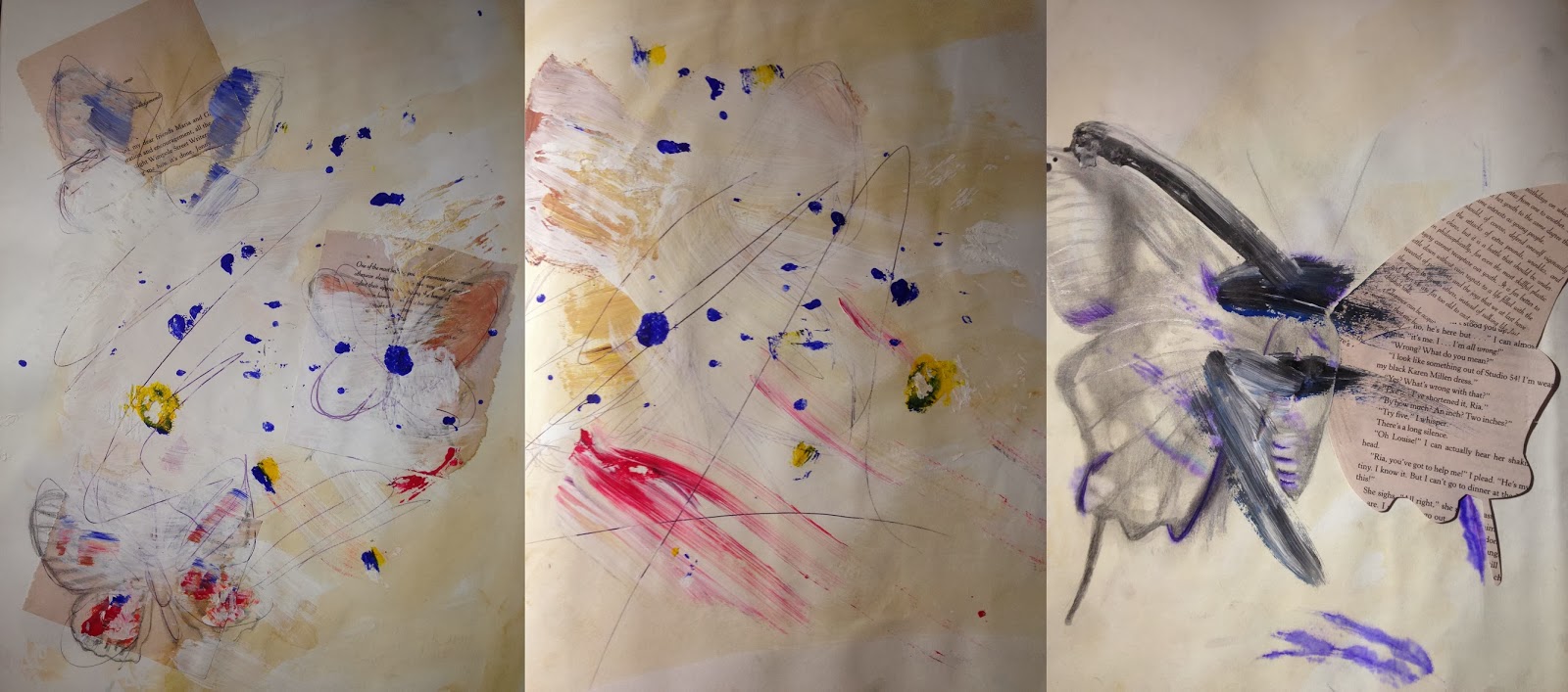
The wings were created whilst observing my own photographs of butterflies (taken with a Nikon camera) :

Also I looked at Michael Cina's painting called 'Deep Layer II' Bellow:

( Above - Michael Cina 'Deep layer II' Acrylic, ink, emulsion on paper (3)
Here is my work inspired by this painting:

For the image on the right side, I used acetate to print out my previous sketches and then made a collage, and the translucent butterflies are in a way representing camouflage and the nature of blending into their surrounding. On the left side is a collage that focuses on a particular butterfly (photograph of the butterfly bellow, taken by me) inspired by 'Deep layer II'. I mostly wanted to experiment with ways that would allow the butterfly wing to blend in with the background but stand out at the same time.

I think Michael Cina's style and techniques are the most influential to create butterfly wings, because his style influences me to make my own work very colourful and expressive, making it stand out as it becomes lively. Also it's the fact that it isn't neat or very precise, as the expressive style is much more suitable for butterflies because all the marks and lines etc. are created free hand, hence my work looks more natural and organic so it resembles the butterfly colours and patterns more effectively.
Continuing with my canvas painting arrangement, I repainted the green background of the big butterfly wing painting, as it did not work together with the other paintings (was not in harmony).
I decided to paint it to a darker black/blue toned colour to match the rest of the paintings, instead of painting the background with oil paint I painted the background with acrylic paint, which meant it did not turn out as well as it would have with acrylic paint. Another problem that I then faced was the fact that the wing and the background were a very similar tone, so they blended with each other and this did not look effective. Although for my theme I am looking how butterflies blend in with the surrounding around them, I wanted the wing to stand out with detail, but still keeping the camouflage etc. in context.
This is why I applied enamel paint onto the paper wing, as enamel is quite effective to drizzle and create fine thin lines, unlike acrylic or other paint. Also whenever it dries it has a glossy finish and still stands out. This brings out the wing and makes it stand out from the rest of the background. Although I think for this wing I may have made the lines too thick and applied rather too much enamel at certain areas.

After this I decided to practice creating more paper wings, both small and large scale ones, so that I could practice using enamel paint and just generally finding the best media to create the wings in. Here is what I created :


All of these wings were still focusing on the blue butterfly photograph as seen earlier, and were inspired by Michael Cina's painting 'Act Free', Bellow:

( Above - Michael Cina 'Act Free' Acrylic, Pigment on paper (2)
Once again the practice of creating lots of different wings was very useful to me because, it allowed me to try out different ways of applying paint, also decide upon what colours go together well, and which butterfly wing would be most appropriate for my final piece idea. Practicing also helped me to learn how to apply enamel in thinner lines, so that they look more fine and elegant on the butterflies.
I have also done a few experiments which I believe were unsuccessful. The 1st experiment was inspired by Michael Cina's painting 'In Motion' where the artist layers similar toned brush stroke lines over each other (Image bellow) So using my own photograph of a blurred flying butterfly i tired to paint in a similar style using acrylic paint.

(Above - Michael Cina 'In Motion' Graphite, acrylic, marker on paper (4)
Bellow is what my work turned out looking like;

To some extent the paintings are quite interesting and expressive and have similar colours as in the photograph that I used to paint this (bellow, my own photo) However the lines seem to all blend together instead of layered, and once more I find that using acrylic paint to fully paint has proven unsuccessful or at least not as good as it could have been. Also this technique and style does not seem appropriate for creating butterfly wings or even a background or my final piece, because it seems to harsh and rough, it would just overdo my final piece, which is what i really don't want to end up doing.

Above is another painting of mine that I consider unsuccessful, this time it was inspired by Michael Cina's painting 'Deep layer II'. The problem my painting is the fact that it is overdone and there it too much going on and it gets quite distracting, this could also be because of bad composition, hence it isn't as appealing to the eye as it possibly could be.
Final piece Idea
After carrying out a range of experiments that were seen above, I was able to start organizing my paintings for possible ideas as well as developing my final piece plan. I also added a few new oil paint sky drawings inspired by Rikka Ayasaki ( http://ievaexamblog.blogspot.co.uk/2014/02/work-inspired-by-artists.html ) and also added additional butterflies, and my final result was this ;

This is almost exact to what I am planing to do for my final piece, Except the sizes and amount of canvases will vary slightly. I am using two different backgrounds because I want to vary the paintings, as having them the same background would look slightly dull and boring. The whole idea of this final piece is observing butterflies in the sky as they are frozen in the moment forever , like each canvas is a photograph, and the bigger butterfly wings are just a zoom into the smaller butterflies on the other canvases.
Reference
1) http://cinaart.com/Rapine
2) http://cinaart.com/Act-Free
3) http://cinaart.com/Deep-Layer-II
4) http://cinaart.com/In-Motion
I have begun developing my ideas towards my final piece. The key aim during my development was to decide upon my final piece idea that relates both to my exam question of 'Closely Observing' and the theme of butterflies & their colours.
At this point I knew that I wanted to chose a canvases as my base for my final piece, similarly as I have already done whilst working in the style of Rebecca J Coles ( https://blogger.googleusercontent.com/img/b/R29vZ2xl/AVvXsEjz7lGA1Tb7GT865WVkeWQye8a6Gx3WnyC0SUX4S06i0xcGIYNf9edZvw92l9LNw6joT8vG9q_8PaXFJRJlBAOvNBZ1GmcoNcLt14D98ofnusG8gzLl-2F0A8yYD53YWgBIsZEqssfGMWE/s1600/BeFunky_DSC_1353.jpg )
I then looked back at all of my canvas work that I had created, during my artists experiments.
This is when I discovered that some of the canvases link together, both style and colour vise, so I re arranged them to this:
As may be seen I have removed the orange canvas, as the orange tones don't go with the blue/purple coloured canvases. I also added a new painting (bottom right side, large butterfly wing with a large background) Which was created from observing my own photograph of a butterfly:
The wing was inspired from my previous experiments ( https://blogger.googleusercontent.com/img/b/R29vZ2xl/AVvXsEiIaXbjSXaeBHy4_z3X3IZRkh-wauOu991eWMzCGlrfLSisbCSCoKjhD392w8eUgS6EwLQDJV43S3B9b-yQXMDmO7Z2Z3kSz36C1fMFwvzubvfZsun_habd18veFahryitHOwuGXIoBEcE/s1600/IMG_28498.jpg ) This really gave me a sense of direction, to what is should do next. Before even creating the large paper butterfly wing painting I first carried out some experiments in my sketch book, here they are bellow:
The idea of having paper wings came from my previous work done in the style of Rebecca J Coles ( https://blogger.googleusercontent.com/img/b/R29vZ2xl/AVvXsEjJ6xddEN-unMXWv04JLwfZ4M_rL_pZuVb_fAJjdH7kHfFbQETZP2CGWQw_pBHtwiu2v1bsgaoBMyjOl30oj-h-hjN-oIuEmENZo1dzFSeoWfuvCgcLu09gUAI3Z_D0zsouAWGufOBFZJY/s1600/gf.jpg ) I have since then made some alterations, for instance instead of doing full body small paper butterflies, I am doing half of a butterfly but on a larger scale alongside the various sizes of the small butterflies.
Neither less my wings are still strongly influenced by Michael Cina, and for these experimental wings, by his painting called "Rapine", image bellow.
(Above - Michael Cina 'Rapine' Pigment and ink on paper. (1)
The wings were created whilst observing my own photographs of butterflies (taken with a Nikon camera) :
Also I looked at Michael Cina's painting called 'Deep Layer II' Bellow:
( Above - Michael Cina 'Deep layer II' Acrylic, ink, emulsion on paper (3)
Here is my work inspired by this painting:
For the image on the right side, I used acetate to print out my previous sketches and then made a collage, and the translucent butterflies are in a way representing camouflage and the nature of blending into their surrounding. On the left side is a collage that focuses on a particular butterfly (photograph of the butterfly bellow, taken by me) inspired by 'Deep layer II'. I mostly wanted to experiment with ways that would allow the butterfly wing to blend in with the background but stand out at the same time.
I think Michael Cina's style and techniques are the most influential to create butterfly wings, because his style influences me to make my own work very colourful and expressive, making it stand out as it becomes lively. Also it's the fact that it isn't neat or very precise, as the expressive style is much more suitable for butterflies because all the marks and lines etc. are created free hand, hence my work looks more natural and organic so it resembles the butterfly colours and patterns more effectively.
Continuing with my canvas painting arrangement, I repainted the green background of the big butterfly wing painting, as it did not work together with the other paintings (was not in harmony).
I decided to paint it to a darker black/blue toned colour to match the rest of the paintings, instead of painting the background with oil paint I painted the background with acrylic paint, which meant it did not turn out as well as it would have with acrylic paint. Another problem that I then faced was the fact that the wing and the background were a very similar tone, so they blended with each other and this did not look effective. Although for my theme I am looking how butterflies blend in with the surrounding around them, I wanted the wing to stand out with detail, but still keeping the camouflage etc. in context.
This is why I applied enamel paint onto the paper wing, as enamel is quite effective to drizzle and create fine thin lines, unlike acrylic or other paint. Also whenever it dries it has a glossy finish and still stands out. This brings out the wing and makes it stand out from the rest of the background. Although I think for this wing I may have made the lines too thick and applied rather too much enamel at certain areas.
After this I decided to practice creating more paper wings, both small and large scale ones, so that I could practice using enamel paint and just generally finding the best media to create the wings in. Here is what I created :
All of these wings were still focusing on the blue butterfly photograph as seen earlier, and were inspired by Michael Cina's painting 'Act Free', Bellow:
( Above - Michael Cina 'Act Free' Acrylic, Pigment on paper (2)
Once again the practice of creating lots of different wings was very useful to me because, it allowed me to try out different ways of applying paint, also decide upon what colours go together well, and which butterfly wing would be most appropriate for my final piece idea. Practicing also helped me to learn how to apply enamel in thinner lines, so that they look more fine and elegant on the butterflies.
I have also done a few experiments which I believe were unsuccessful. The 1st experiment was inspired by Michael Cina's painting 'In Motion' where the artist layers similar toned brush stroke lines over each other (Image bellow) So using my own photograph of a blurred flying butterfly i tired to paint in a similar style using acrylic paint.
(Above - Michael Cina 'In Motion' Graphite, acrylic, marker on paper (4)
Bellow is what my work turned out looking like;
To some extent the paintings are quite interesting and expressive and have similar colours as in the photograph that I used to paint this (bellow, my own photo) However the lines seem to all blend together instead of layered, and once more I find that using acrylic paint to fully paint has proven unsuccessful or at least not as good as it could have been. Also this technique and style does not seem appropriate for creating butterfly wings or even a background or my final piece, because it seems to harsh and rough, it would just overdo my final piece, which is what i really don't want to end up doing.
Final piece Idea
After carrying out a range of experiments that were seen above, I was able to start organizing my paintings for possible ideas as well as developing my final piece plan. I also added a few new oil paint sky drawings inspired by Rikka Ayasaki ( http://ievaexamblog.blogspot.co.uk/2014/02/work-inspired-by-artists.html ) and also added additional butterflies, and my final result was this ;
This is almost exact to what I am planing to do for my final piece, Except the sizes and amount of canvases will vary slightly. I am using two different backgrounds because I want to vary the paintings, as having them the same background would look slightly dull and boring. The whole idea of this final piece is observing butterflies in the sky as they are frozen in the moment forever , like each canvas is a photograph, and the bigger butterfly wings are just a zoom into the smaller butterflies on the other canvases.
Reference
1) http://cinaart.com/Rapine
2) http://cinaart.com/Act-Free
3) http://cinaart.com/Deep-Layer-II
4) http://cinaart.com/In-Motion
Wednesday, 19 March 2014
Recently I have visited a butterfly farm in Stratford-Upon-Avon where I had an opportunity to take various photographs of butterflies. Here are some of the photographs I have taken:
 These photographs will be very useful to help me progress my work, and start experimenting with different media and techniques to discover ways in which I could draw/paint the wings of butterflies. Also it allows me to think which butterflies would be most suitable along with my sky backgrounds, as it is important that both the sky and the butterflies are similar toned, since I'm focusing how butterflies adapt to their environment through their colours.
I have already had a chance to work from some of the photos I have taken, helping me refine my work and style towards my final piece idea, I looked at some unusual ways of representing butterflies. Instead of drawing/painting etc. a grown colourful butterfly, I created a collage of pupa's (immature form between larva and adult, when the insect is warped up in a cocoon) It is interesting to observe different forms of the same insect, as it takes us back to a different stage of their mostly short life cycle. Here is the work I produced:

It was quite interesting and slightly challenging creating pupa's' in my work, as their texture and whole appearance requires different media to be used unlike when creating a grown up butterfly. Even though I think these experiments did work moderately well, I still prefer observing fully grown butterflies as they give me more ideas of how to draw/produce them.
Also I used some of the photographs from the butterfly farm to print them out on acetate, in order to go back through my previous work and see how various backgrounds make the butterflies look. Here are the most successful backgrounds:

Even though I consider these to have worked the best, I still think that the background is overtaking the butterflies, and they don't stand out as well so the viewers eyes loose attention of the butterflies. I think the best ways to make the butterflies look effective would be if the background was quite plain and simple not overdone or very bright, and then the butterflies would be full of detail colour and tone, but still working well and slightly blending with the colours of the background.
I have already had a chance to work from some of the photos I have taken, helping me refine my work and style towards my final piece idea, I looked at some unusual ways of representing butterflies. Instead of drawing/painting etc. a grown colourful butterfly, I created a collage of pupa's (immature form between larva and adult, when the insect is warped up in a cocoon) It is interesting to observe different forms of the same insect, as it takes us back to a different stage of their mostly short life cycle. Here is the work I produced:
Also I used some of the photographs from the butterfly farm to print them out on acetate, in order to go back through my previous work and see how various backgrounds make the butterflies look. Here are the most successful backgrounds:
Even though I consider these to have worked the best, I still think that the background is overtaking the butterflies, and they don't stand out as well so the viewers eyes loose attention of the butterflies. I think the best ways to make the butterflies look effective would be if the background was quite plain and simple not overdone or very bright, and then the butterflies would be full of detail colour and tone, but still working well and slightly blending with the colours of the background.
Sunday, 9 March 2014
Butterflies and Moths
Recently I have been trying to take photographs of butterflies and also I have done some research about them that in a way helps me by giving me more knowledge about them.

This is a photograph I took recently of a butterfly, according to some research this is a common European butterfly species called Sulphurs. I think it's fascinating how similar the closed butterfly wings look to leafs of plants. It is a clever way for insects like butterflies to camouflage themselves from any dangers that they may face. This gives me inspiration for my butterfly theme, so far I have mostly focused on butterflies and their colours, but now I have an idea of observing how butterflies use their bodies in order to blend in, become unnoticed, unless focused on closely. It reminds me of some work that I have done in the style of Rebbeca J Coles, where I painted a sky, from my own photograph and then created paper butterflies that looked similar to the background to make them blend in more. https://blogger.googleusercontent.com/img/b/R29vZ2xl/AVvXsEjz7lGA1Tb7GT865WVkeWQye8a6Gx3WnyC0SUX4S06i0xcGIYNf9edZvw92l9LNw6joT8vG9q_8PaXFJRJlBAOvNBZ1GmcoNcLt14D98ofnusG8gzLl-2F0A8yYD53YWgBIsZEqssfGMWE/s1600/BeFunky_DSC_1353.jpg . I want to take this idea further, I want to show butterflies captured "flying" in some sort of sky or background, like they are frozen in time. Because I found out "An adult butterfly probably has an average life-span of approximately one month. In the wild, most butterflies lives are shorter than this because of the dangers provided by predators, disease, and large objects, such as automobiles. The smallest butterflies may live only a week or so, while a few butterflies, such as Monarchs, Mourning Cloaks and tropical heliconians, can live up to nine months." (1) So although we usually see them round both spring and summer, we may not realize how short their life-span is, and the fact that most likely we see a specific butterfly only once.
Also not so long ago I managed to capture images of 2 different moths that were on my window during night time.

I have discovered "Butterflies and moths are evolutionarily related group of insects, called lepidoptera, that share many characteristics, including having wings covered with scales...Many butterflies are very colorful and almost all butterflies are active exclusively during the day. In contrast, most moths are fairly drably colored and are active at night. But there are quite a few butterflies that are dull and quite a few moths that are brilliantly colored and fly during the daytime. " (1)
I find the whole idea of moths being the "night" butterflies quite interesting, because before seeing those two moths on my window, I never really thought about them, or even the fact that they are relevant to my butterfly theme. It's like a contrast between good and the bad. Because usually butterflies are assumed as the pretty non-scary looking insects, whilst moths are quite dull and seen more as pests that aren't as likable.
Maybe I could consider connecting the two insects together, to represent the day and the night, although I am not sure about this. However I still did some moth drawings inspired by Michael Cina.
Michael Cina - "Past Context" Collage.


I have already drawn butterflies in the same style before earlier in my sketch book (although using conte crayon and chalk for butterflies that are light coloured and delicate was not very suitable, I think it works well for drawing moths because the neutral paper colours, conte-crayon and chalk combined together create this dull organic and natural looking colour tone, that is quite similar to a moth. Overall I still prefer to have the main subject as butterflies, however it was interesting to examine and draw moths, to discover different ways to draw them.
References
1) http://naba.org/qanda.html
This is a photograph I took recently of a butterfly, according to some research this is a common European butterfly species called Sulphurs. I think it's fascinating how similar the closed butterfly wings look to leafs of plants. It is a clever way for insects like butterflies to camouflage themselves from any dangers that they may face. This gives me inspiration for my butterfly theme, so far I have mostly focused on butterflies and their colours, but now I have an idea of observing how butterflies use their bodies in order to blend in, become unnoticed, unless focused on closely. It reminds me of some work that I have done in the style of Rebbeca J Coles, where I painted a sky, from my own photograph and then created paper butterflies that looked similar to the background to make them blend in more. https://blogger.googleusercontent.com/img/b/R29vZ2xl/AVvXsEjz7lGA1Tb7GT865WVkeWQye8a6Gx3WnyC0SUX4S06i0xcGIYNf9edZvw92l9LNw6joT8vG9q_8PaXFJRJlBAOvNBZ1GmcoNcLt14D98ofnusG8gzLl-2F0A8yYD53YWgBIsZEqssfGMWE/s1600/BeFunky_DSC_1353.jpg . I want to take this idea further, I want to show butterflies captured "flying" in some sort of sky or background, like they are frozen in time. Because I found out "An adult butterfly probably has an average life-span of approximately one month. In the wild, most butterflies lives are shorter than this because of the dangers provided by predators, disease, and large objects, such as automobiles. The smallest butterflies may live only a week or so, while a few butterflies, such as Monarchs, Mourning Cloaks and tropical heliconians, can live up to nine months." (1) So although we usually see them round both spring and summer, we may not realize how short their life-span is, and the fact that most likely we see a specific butterfly only once.
Also not so long ago I managed to capture images of 2 different moths that were on my window during night time.
I have discovered "Butterflies and moths are evolutionarily related group of insects, called lepidoptera, that share many characteristics, including having wings covered with scales...Many butterflies are very colorful and almost all butterflies are active exclusively during the day. In contrast, most moths are fairly drably colored and are active at night. But there are quite a few butterflies that are dull and quite a few moths that are brilliantly colored and fly during the daytime. " (1)
I find the whole idea of moths being the "night" butterflies quite interesting, because before seeing those two moths on my window, I never really thought about them, or even the fact that they are relevant to my butterfly theme. It's like a contrast between good and the bad. Because usually butterflies are assumed as the pretty non-scary looking insects, whilst moths are quite dull and seen more as pests that aren't as likable.
Maybe I could consider connecting the two insects together, to represent the day and the night, although I am not sure about this. However I still did some moth drawings inspired by Michael Cina.
Michael Cina - "Past Context" Collage.
I have already drawn butterflies in the same style before earlier in my sketch book (although using conte crayon and chalk for butterflies that are light coloured and delicate was not very suitable, I think it works well for drawing moths because the neutral paper colours, conte-crayon and chalk combined together create this dull organic and natural looking colour tone, that is quite similar to a moth. Overall I still prefer to have the main subject as butterflies, however it was interesting to examine and draw moths, to discover different ways to draw them.
References
1) http://naba.org/qanda.html
Michael Cina
I have continued experimenting in more ways of my chosen artists, I have particularly focused on Michael Cina's style. I have already before worked in the style of his painting called "Ways of Serigraphs" ( http://cinaart.com/Ways-of-Serigraphs ).
Here is my previous work( https://blogger.googleusercontent.com/img/b/R29vZ2xl/AVvXsEj36CeyHGBW_fh3dJcVZQmbe4ygvlCFEwr8zxtOCtZk3fiWFgZYcvk8CDYJX_Vnm_Mv77gGMEe9zKtM7I8MP20GHM50-OKKjfCVR-mG3O2hVnELF4Qpm-u56E4WyYktiw2jjf4zKl8MHrM/s1600/IMG_2417.jpg ) However I have decided to experiment even more in this chosen paintings style, by using an even wider range of media. Here are the pages I created;


As may be seen above, this time I tried layering the media more to create a more textured surface, also similarly to "Ways of Serigraphs" this time, unlike in the previous drawings I have drawn, the lines created were continuous and quite free flowing. Although this technique and style is creative and expressive, It does not seem to be a suitable style for delicate creatures like butterflies. However I have considered the artist style to be very effective as background.
Bellow I created an assemblage/painting on canvas ( 23 x 30 cm) once again it was inspired by mostly Michael Cinas's painting "Ways of Serigraphs". My painting was created using tea stains, books, stamps, acrylic paint, pen, PVA glue and hairspray. In the begging the initial idea was to create a background in Cina's style, however as my painting progressed I decided that it needed a main of butterflies, so I combined Michael Cina's style with Rebecca J Coles butterfly assemblage idea and style. (http://ievaexamblog.blogspot.co.uk/2014/02/artist-analysis-rebecca-j-coles.html )

Overall the actual background turned out quite effective, for instance there is a variation of texture from rough (as the surface is quite uneven) to glossy and smooth surface (from the application of PVA glue and hairspray on the top layer of the painting). The one downside is the butterflies don't really stand out, as they are similar colour and material as the background. Even if visually they may not stand out, in real life butterflies often blend in and camouflage with various surfaces in order to hide or be unnoticed by predators to protect themselves, so in a way this could be viewed as butterflies in camouflage, and only if you concentrate and closely observe may you notice them. It is quite similar to some of the butterfly images that I have photographed, where they blend in with similar coloured surfaces and objects. Here are the photographs https://blogger.googleusercontent.com/img/b/R29vZ2xl/AVvXsEi-BXu61NjIAxHQ5UAJQywzI18hNBfVaGXsGlBg1hJSxcNyMgMac7S4WI1_2AGMDFLRUVpsspyaeeIAoGzDlQ-GZrD6dQPI7wQQ5DlbUb8Kor_F_dSEONmPBDWF3f9jeIIM08YZYgbnvfY/s1600/DSC_0481.JPG and
I also tried to work in the style of his other paintings.
Bellow Michael Cina - "From Above" Mixed Media on Paper.(left) (1) and Michael Cina - "Rapine" Pigment and Ink on paper. (right) (2)
 Bellow are 3 images inspired by the paintings above

These styles work very effectively to show layering of colours, as paint gradually gets layered on previously dried acrylic and oil paint creating a pigmented surface, that is both smooth and rough. Also the bright colours make the paintings look colourful and lively. This style is great as a background or base of my work.
Bellow Michael Cina "Tokyo Paedia" (3) mixed media on paper (left) and Michael Cina "Document Series" media: paper (right), Have inspired me to create collages with delicate butterfly drawings.
 Here is my work bellow:


The reason I like Cina's collages, is they are simple yet effective, they don't consist of a lot of detail, and simplicity makes them stand out. I tried creating my own collages, inspired by "Tokyo Paedia" except after I had created the base of the collages, over the top I drew observational drawings of parts of a butterfly (bellow)
.jpg)
This style has helped me to think of how to combine both expressive, free hand organic looking backgrounds with detailed drawings, so that they would not be overshadowed by what is behind them. I now know that it work best when the background is not too bright or overdone, but more neutral and simple looking.
Lastly I took inspiration from Michael Cina's painting called "Toledo" Acrylic on paper (4) bellow.

Here are my experiments bellow :

The style of "Toledo" is rather unusual, it looks like the painting was made with very minim marks, like paint was just scraped above the surface. This is why for my experiments, I applied the acrylic paint onto the black paper using a piece of cardboard, the dipping it into the paint and then freely and without applying too much pressure scraping it over the black paper. It is quite a simple yet very interesting painting style do work in. It just shows that by choosing the right colours like light paint on black surface, can make the work be bold with minimum marks required.
References:
1) http://cinaart.com/From-Above
2) http://cinaart.com/Rapine
3) http://cinaart.com/Tokyo-Paedia
4) http://cinaart.com/Toledo
5) http://cinaart.com/Document-Series
Here is my previous work( https://blogger.googleusercontent.com/img/b/R29vZ2xl/AVvXsEj36CeyHGBW_fh3dJcVZQmbe4ygvlCFEwr8zxtOCtZk3fiWFgZYcvk8CDYJX_Vnm_Mv77gGMEe9zKtM7I8MP20GHM50-OKKjfCVR-mG3O2hVnELF4Qpm-u56E4WyYktiw2jjf4zKl8MHrM/s1600/IMG_2417.jpg ) However I have decided to experiment even more in this chosen paintings style, by using an even wider range of media. Here are the pages I created;
As may be seen above, this time I tried layering the media more to create a more textured surface, also similarly to "Ways of Serigraphs" this time, unlike in the previous drawings I have drawn, the lines created were continuous and quite free flowing. Although this technique and style is creative and expressive, It does not seem to be a suitable style for delicate creatures like butterflies. However I have considered the artist style to be very effective as background.
Bellow I created an assemblage/painting on canvas ( 23 x 30 cm) once again it was inspired by mostly Michael Cinas's painting "Ways of Serigraphs". My painting was created using tea stains, books, stamps, acrylic paint, pen, PVA glue and hairspray. In the begging the initial idea was to create a background in Cina's style, however as my painting progressed I decided that it needed a main of butterflies, so I combined Michael Cina's style with Rebecca J Coles butterfly assemblage idea and style. (http://ievaexamblog.blogspot.co.uk/2014/02/artist-analysis-rebecca-j-coles.html )
Overall the actual background turned out quite effective, for instance there is a variation of texture from rough (as the surface is quite uneven) to glossy and smooth surface (from the application of PVA glue and hairspray on the top layer of the painting). The one downside is the butterflies don't really stand out, as they are similar colour and material as the background. Even if visually they may not stand out, in real life butterflies often blend in and camouflage with various surfaces in order to hide or be unnoticed by predators to protect themselves, so in a way this could be viewed as butterflies in camouflage, and only if you concentrate and closely observe may you notice them. It is quite similar to some of the butterfly images that I have photographed, where they blend in with similar coloured surfaces and objects. Here are the photographs https://blogger.googleusercontent.com/img/b/R29vZ2xl/AVvXsEi-BXu61NjIAxHQ5UAJQywzI18hNBfVaGXsGlBg1hJSxcNyMgMac7S4WI1_2AGMDFLRUVpsspyaeeIAoGzDlQ-GZrD6dQPI7wQQ5DlbUb8Kor_F_dSEONmPBDWF3f9jeIIM08YZYgbnvfY/s1600/DSC_0481.JPG and
I also tried to work in the style of his other paintings.
Bellow Michael Cina - "From Above" Mixed Media on Paper.(left) (1) and Michael Cina - "Rapine" Pigment and Ink on paper. (right) (2)
These styles work very effectively to show layering of colours, as paint gradually gets layered on previously dried acrylic and oil paint creating a pigmented surface, that is both smooth and rough. Also the bright colours make the paintings look colourful and lively. This style is great as a background or base of my work.
Bellow Michael Cina "Tokyo Paedia" (3) mixed media on paper (left) and Michael Cina "Document Series" media: paper (right), Have inspired me to create collages with delicate butterfly drawings.
The reason I like Cina's collages, is they are simple yet effective, they don't consist of a lot of detail, and simplicity makes them stand out. I tried creating my own collages, inspired by "Tokyo Paedia" except after I had created the base of the collages, over the top I drew observational drawings of parts of a butterfly (bellow)
This style has helped me to think of how to combine both expressive, free hand organic looking backgrounds with detailed drawings, so that they would not be overshadowed by what is behind them. I now know that it work best when the background is not too bright or overdone, but more neutral and simple looking.
Lastly I took inspiration from Michael Cina's painting called "Toledo" Acrylic on paper (4) bellow.
Here are my experiments bellow :
The style of "Toledo" is rather unusual, it looks like the painting was made with very minim marks, like paint was just scraped above the surface. This is why for my experiments, I applied the acrylic paint onto the black paper using a piece of cardboard, the dipping it into the paint and then freely and without applying too much pressure scraping it over the black paper. It is quite a simple yet very interesting painting style do work in. It just shows that by choosing the right colours like light paint on black surface, can make the work be bold with minimum marks required.
References:
1) http://cinaart.com/From-Above
2) http://cinaart.com/Rapine
3) http://cinaart.com/Tokyo-Paedia
4) http://cinaart.com/Toledo
5) http://cinaart.com/Document-Series
Monday, 24 February 2014
Work inspired by artists
Previously in my sketch book I have done a series of experiments of Rikka Ayasaki's work by observing small sections of her paintings.


Above on the left side is a photograph I took in Lithuania during the summer of 2013, from my grandmothers flat balcony.
I thought this photograph was great to use to work in Ayasaki's style, because similarly to her work, this photo contains lots various different shaded colours, with darker and lighter areas. The image on the right side is my painting outcome.
As you can see I only focused on the sky, and did not include the buildings. I faced a similar problem as with the painting of 'Spring haze 7030' I finger painted with oil paint on a canvas ( 23 x 30 cm) , meaning the colours were all smooth and blended up together, meaning I could not really create a cloud effect etc. Even so, I think this painting turned out quite effectively, because instead of focusing on the details of the clouds etc. I put more effort into getting the colours and tones right (overall observed colours of the sky the most), however there was a minor problem with the paint, because as you can see in the original photograph the right bottom corner of the sky is a soft yellow colours, whereas in the painting it is a dirty light blue, this happened because i tried to blend the light yellow and light blue oil paint, whilst the paint was still wet, so it became slightly light green. This can be fixed by going over the greener area with light yellow oil paint.

Since then my work has progressed and I have began working in her style on canvas using oil paint, I firstly worked by observing her painting 'Spring haze 7030'.
Bellow Rikka Ayasaki 'Spring haze 7030' created in 2013, Acrylic painting, (55 x 46 cm) (left) (1) and my experimental painting from observing 'Spring haze 7030', media used oil paint on canvas ( 23 x 30 cm) (right)
Bellow Rikka Ayasaki 'Spring haze 7030' created in 2013, Acrylic painting, (55 x 46 cm) (left) (1) and my experimental painting from observing 'Spring haze 7030', media used oil paint on canvas ( 23 x 30 cm) (right)
The overall outcome of this painting is quite different to what I expected. Firstly Rikka Ayasaki painted 'Spring haze 7030' using acrylic paint and most likely a paint brush, whereas I decide to finger paint using oil paint. The reason why I chose to paint in this way, was because from the experimental studies that I carried out in my sketch book I discovered that oil paint is more creamy and blends more effectively, in my opinion even looks better, as acrylic paint left streaks and the colours did not blend gradually as expected. There were quite a few problems whilst painting,firstly my painting is very smooth and the colours are all blended together in a horizontal motion, but Rikka Ayasaki's 'Spring haze 7030' has more circular shapes, for instance she painted her clouds so that they would stand out, whereas mine just blended in. Another problem was the green hill at the bottom of the painting, as seen in 'Spring haze 7030' it contains tones with various colours and shades (brown, green, burgundy etc.) Yet mine is mostly plain green, however I did try applying more colours to it, however because the green coloured paint was still wet, the colours just blended up with the green and became hardly visible. I think what I should have done was wait until the first layer of paint dried up a bit, ant then went over it in the other colour, however I can still do this. Also maybe if i would have used a paintbrush the painting would not be as blended, also I could have used turp substitute to thin down some of the paint.
After the experiment with 'Spring haze 7030' I decide to start working in the style of Ayasaki from my own photographs.
Above on the left side is a photograph I took in Lithuania during the summer of 2013, from my grandmothers flat balcony.
As you can see I only focused on the sky, and did not include the buildings. I faced a similar problem as with the painting of 'Spring haze 7030' I finger painted with oil paint on a canvas ( 23 x 30 cm) , meaning the colours were all smooth and blended up together, meaning I could not really create a cloud effect etc. Even so, I think this painting turned out quite effectively, because instead of focusing on the details of the clouds etc. I put more effort into getting the colours and tones right (overall observed colours of the sky the most), however there was a minor problem with the paint, because as you can see in the original photograph the right bottom corner of the sky is a soft yellow colours, whereas in the painting it is a dirty light blue, this happened because i tried to blend the light yellow and light blue oil paint, whilst the paint was still wet, so it became slightly light green. This can be fixed by going over the greener area with light yellow oil paint.
I then decided to experiment with darker colours, so I decided to paint from a photograph that I took on the 18th of February 2014, whilst traveling in a car home from Oxford.( photograph on the left bellow) and on the right is what my painting turned out as.

This painting was Once again done by finger painting with oil paint on a canvas ( 23 x 30 cm) Hence why there are obvious horizontal lines of a rubbing/blending motion. This painting was really hard to do because the darker colours were much harder to blend, and even thought as seen in the original photograph there were lighter orange coloured areas, because of the blue wet paint mixing up with the orange paint creating green unwanted colour, and just generally dark paint, the lighter areas were hard to do, so I will go over them again, since now the paint is dry so the orange paint wont mix with the blue.
Lastly (still focusing on the same photograph) I decided to merge two artist styles together. So I used Rikka's Ayasaki's landscape painting style idea and merged it with Rebecca J Coles paper butterfly assemblage style.
Here is the final result
As all the other paintings I once again finger painted with oil paint, even thought there is disadvantages of doing so, I personally find that finger painting allows me to have more control over what I paint, and I don't get the same control when I use a paintbrush.
This attempt of the sunset painting was much better, because the colours blended together slightly better, although I still experienced the unwanted green paint problem. For the paper butterflies, I used a similar Idea to the butterflies that I have already done in Rebecca J Coles style, however differently to the butterflies I done before, this time I used older book pages, that looked more worn and old, and then I slightly burned some of the butterflies, to create this old fragile look, similarly how a dead pinned down butterfly would be very fragile as well. I tried to used paper that was more natural and organic looking, because if I would have used some bright coloured pages (like pink or green) for the butterfly silhouettes, there would be no colour harmony, and the whole piece would not look as bold and effective.
I personally feel, like there does not need to be anything more added to the piece, because I like it looking as it is, and I don't want to overdo it. However I feel there may be a need to add some sort of texture to the canvas surface.
Reference;
1) http://www.saatchiart.com/art/Painting-Spring-haze-7030-55x46cm-Painted-in-2013/6134/1911688/view
Saturday, 22 February 2014
Artist Analysis - Michael Cina
Michael Cina is an artists,painter and graphic designer, currently based in Minneapolis, USA. He is known for creating work that is innovative and somewhat unconventional. In 2000's Michael Cina became a co-finder of WeWorkForThem design studio and in 2010 he opened his own design studio called Cina Associates. He creates both painting and collages, and in all of his work he uses a wide variety of various media such as : pigment, ink, acrylic paint, boards, paper, canvas, water colour, graphite, serigraph, tempera etc.
What I found unusual about his work, is the way it's expressive, free flowing, with no particular clear lines, quite unclear with no specific subject. Yet when observed with more effort, the viewer is able to see something in his work, some sort of subject with the help of imagination, and it may be different for each individual.
The majority of his work is very bold and bright, very lively and energetic, however in a way still modest and not overdone. His work expresses shapes, forms and even mood.
When talking about his own work Cina has said "Observation is very important to me. I don’t see myself having much to do with fantasy, but I do have a fascination for the unseen. When I see something that interests me, I try to understand why I like that particular thing. Is it the color, form, shape, composition, texture, etc?" (1) This suggest that the artist is very experimental both in the terms of the media he uses and the way he paints. I also found out that in a interview he describe his work process and the way his work turns out by "I have always learned best through “accidents.” Early in my career, I noticed that “mistakes” (early in the creative process) can be a huge asset. So I have tried to incorporate making mistakes into how I work" (1)
Here is some of his work bellow:

As seen, his work does not consist of a specific subject, however there is probably a strong meaning or emotion behind it. For instance the artist has said that a big part of his work inspiration is music, as it takes up a big part in his life. So all of this work could have been done to express that music, the way it makes him feel, which might justify why his work is so organic.
I have chosen to analyse one of his paintings called 'Vault of the Sky'. The media used for this painting is acrylic on museum board 2" frame. (reference link 5) Here is the image bellow:

To me it is an expressive abstract painting, I feel like there does not need to be a huge splash of various colours, to make it expressive. The reason I like this painting so much is because it looks uplifting. When I look at this painting, It makes me imagine that I am rising up from underwater in the sea but never actually reach the top,although I'm surrounded by the light of the sun the dark endless water is still around me. Or maybe this painting represents the rising of the sun, as the light yellow sunlight slowly reclaims the sky from the darkness. Honestly there are so many things this painting can be representing, it could merely just be a painting expressing the feeling of how music or happiness warms up your mind/body, it really is all up to the viewers imagination.
Also the layering of the paint creates this bumpy uneven texture, this is probably because the acrylic paint in 'Vault of the Sky' is applied quite energetically and It seems to me that there was either water applied to the surface to add this uneven texture, or there was something pressed down against the surface whilst the paint was wet, because it appears as if air bubbles formed on the surface of the painting, especially round the right side where the pink paint is.
The painting is in a 2D form, however there is no clear shapes or lines in it, as mentioned before the whole painting is free flowing and quite organic, as it was created freehand. Even so there does not need to be clear lines or some specific subject, because this way the painting is more unique and original, you would not get or recreate exactly the same thing ever again.
Composition wise , when I look at the painting the first thing that I notice is the light colours at the bottom of the image, and only after that do I notice the dark black colours, because it is not as lively and bright as the yellow and pink pastel colours.
Overall I think I could use Michael Cina's style and techniques as there is so much I can experiment with. He has used a huge variety of media through out different pieces of his work allowing me to freely explore different options and see how different media turns out on different materials. Also I am impressed by his expression of emotions through colours, with no need of justifying or showing a clear subject. I think because my theme is developing around butterfly colours, his style would really help me to figure out a way to show the beautiful colours their wings have, without the actual need of having the butterfly, in a way zooming in just into the colour itself and closely observing it.
I have already tried to work inspired by 'Vault of the Sky' by layering acrylic paint and ink together, to create a chipping paint effect with gradual colour change similar to Cina's work. Here is my work bellow :

I like the effect that the layering of the two medias creates, as there are both lighter and darker tones creates. I took this technique even further and created a butterfly drawing using conte-crayon, ink and pencil, using this photograph of a butterfly Here is my work bellow :

Although this drawing did not turn out as successful as I hoped, it gave me the idea of using media other than pens or pencils to draw and add detail to butterfly wings with free hand drawing. In a way free-flowing lines create a more effective and organic and natural looking effect, than it would if i was to carefully draw the butterfly.
Reference:
2) http://cinaart.com/Art/Hovering-Over-the-Water
3) http://cinaart.com/Art/Apex
4) http://cinaart.com/Art/Funerary-In-Soft-Limestone
5) http://cinaart.com/Art/Vault-of-the-Sky
6) http://www.marlboroughgallery.com/exhibitions/threading-orbs-an-exhibition-of-recent-tapestries-and-works-on-paper-by-thierry-w-despont
What I found unusual about his work, is the way it's expressive, free flowing, with no particular clear lines, quite unclear with no specific subject. Yet when observed with more effort, the viewer is able to see something in his work, some sort of subject with the help of imagination, and it may be different for each individual.
The majority of his work is very bold and bright, very lively and energetic, however in a way still modest and not overdone. His work expresses shapes, forms and even mood.
When talking about his own work Cina has said "Observation is very important to me. I don’t see myself having much to do with fantasy, but I do have a fascination for the unseen. When I see something that interests me, I try to understand why I like that particular thing. Is it the color, form, shape, composition, texture, etc?" (1) This suggest that the artist is very experimental both in the terms of the media he uses and the way he paints. I also found out that in a interview he describe his work process and the way his work turns out by "I have always learned best through “accidents.” Early in my career, I noticed that “mistakes” (early in the creative process) can be a huge asset. So I have tried to incorporate making mistakes into how I work" (1)
Here is some of his work bellow:
Above, Michael Cina - 'Hovering Over the Water' fermented acrylic on paper (left) (2) and Michael Cina - 'Apex' Archival ink prints on Cotton Archival paper (right) (3)
As seen, his work does not consist of a specific subject, however there is probably a strong meaning or emotion behind it. For instance the artist has said that a big part of his work inspiration is music, as it takes up a big part in his life. So all of this work could have been done to express that music, the way it makes him feel, which might justify why his work is so organic.
I have chosen to analyse one of his paintings called 'Vault of the Sky'. The media used for this painting is acrylic on museum board 2" frame. (reference link 5) Here is the image bellow:
To me it is an expressive abstract painting, I feel like there does not need to be a huge splash of various colours, to make it expressive. The reason I like this painting so much is because it looks uplifting. When I look at this painting, It makes me imagine that I am rising up from underwater in the sea but never actually reach the top,although I'm surrounded by the light of the sun the dark endless water is still around me. Or maybe this painting represents the rising of the sun, as the light yellow sunlight slowly reclaims the sky from the darkness. Honestly there are so many things this painting can be representing, it could merely just be a painting expressing the feeling of how music or happiness warms up your mind/body, it really is all up to the viewers imagination.
'Vault of the Sky' is similar to work by an artist and architect called Thierry Despont, who creates paintings of various planets, his work has been described as follows "The imagery of the paintings is based on heavenly orbs: mysterious planets that revolve from darkness into light". There is resemblance between the two artists work because the paintings have a similar texture, surface and the appearance as a whole. Possibly 'Vault of the Sky' can be viewed as a close up of the moon or another rocky surface planet. Bellow are some images of work by Thierry Despont.

Above, Thierry Despont "NB 17-T" 2010 ,Jacquard tapestry (left) (6) and Thierry Despont "NB 06-T" 2010, Jacquard tapestry (right) (6)
Above, Thierry Despont "NB 17-T" 2010 ,Jacquard tapestry (left) (6) and Thierry Despont "NB 06-T" 2010, Jacquard tapestry (right) (6)
I think what makes 'Vault of the Sky' stand out so effectively is the contrast between the black and the use of pastel pink and yellow colours, as they are lighter they illuminate the whole painting, as if lights at night. Also because the colours are layered over each other they create this gradual change in tone from one color or shade into the next, fading and softening into the other colour, especially the pastel pink and pastel yellow colours, but then there is this quick and bold change in colour when from the two soft colours into black. This really adds a bold effect to the painting, especially highlighting the softer, lighter colours.
Also the layering of the paint creates this bumpy uneven texture, this is probably because the acrylic paint in 'Vault of the Sky' is applied quite energetically and It seems to me that there was either water applied to the surface to add this uneven texture, or there was something pressed down against the surface whilst the paint was wet, because it appears as if air bubbles formed on the surface of the painting, especially round the right side where the pink paint is.
The painting is in a 2D form, however there is no clear shapes or lines in it, as mentioned before the whole painting is free flowing and quite organic, as it was created freehand. Even so there does not need to be clear lines or some specific subject, because this way the painting is more unique and original, you would not get or recreate exactly the same thing ever again.
Composition wise , when I look at the painting the first thing that I notice is the light colours at the bottom of the image, and only after that do I notice the dark black colours, because it is not as lively and bright as the yellow and pink pastel colours.
Overall I think I could use Michael Cina's style and techniques as there is so much I can experiment with. He has used a huge variety of media through out different pieces of his work allowing me to freely explore different options and see how different media turns out on different materials. Also I am impressed by his expression of emotions through colours, with no need of justifying or showing a clear subject. I think because my theme is developing around butterfly colours, his style would really help me to figure out a way to show the beautiful colours their wings have, without the actual need of having the butterfly, in a way zooming in just into the colour itself and closely observing it.
I have already tried to work inspired by 'Vault of the Sky' by layering acrylic paint and ink together, to create a chipping paint effect with gradual colour change similar to Cina's work. Here is my work bellow :
Although this drawing did not turn out as successful as I hoped, it gave me the idea of using media other than pens or pencils to draw and add detail to butterfly wings with free hand drawing. In a way free-flowing lines create a more effective and organic and natural looking effect, than it would if i was to carefully draw the butterfly.
Reference:
3) http://cinaart.com/Art/Apex
4) http://cinaart.com/Art/Funerary-In-Soft-Limestone
5) http://cinaart.com/Art/Vault-of-the-Sky
6) http://www.marlboroughgallery.com/exhibitions/threading-orbs-an-exhibition-of-recent-tapestries-and-works-on-paper-by-thierry-w-despont
Subscribe to:
Comments (Atom)